

At the time, 1990s fashion trends were widely debated. The era’s signature looks and motifs, like bright colors, wild prints and an unprecedented level of baggy, weren’t universally adored. Now, however, and with some distance, love for ’90s fashion, especially among Gen Z, is stronger than ever. Patterned track suits and audacious designs (whether new or vintage) can be spotted everywhere. And not just on the sidewalks and catwalks but on the soccer pitch, too.
Today, leagues across the world are holding “retro weeks” for teams to wear vintage-inspired kits. We’re seeing the billowy cuts and outrageous patterns of ’90s soccer all over again. And though the team jerseys are great, it’s the goalkeepers’ kits that take it to an entirely different level.
Unlike the rest of the team, goalkeepers worldwide are encouraged to wear jerseys that stand out on the pitch. Being instantly distinguishable from the other players on the field provides a degree of safety and visibility, which in turn makes it easier for players and officials to make split-second decisions around and about the keeper. Freed from the constraints of the unified look of the rest of their team, keepers and kit designers have always jumped at the chance to make something truly one-of-a-kind. This is true now, too, but it’s nothing like it was in the ’90s. Amping up every element of the era’s standout themes, goalie kits, made from the same lightweight polyester and mesh typical of soccer jerseys, became the most memorable of all time –– even if some looked like the Mad Hatter had stitched a bunch of camping tents together.
Here, we take a look back at the days when absolute sartorial legends stood between the posts.
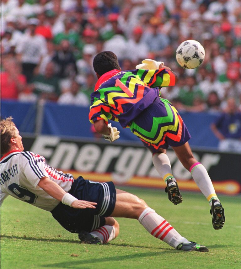
MEXICO
1994
Despite earlier keepers rejecting the pattern created by Daniel Ríos of Aca Sport, once Jorge Campos wore it on his keeper’s jersey, the pattern won a place in fans’ hearts — and kit history. If there’s one jersey that epitomizes ’90s goalkeeper looks, it’s this one.
Not only did the iconic Campos embrace the neon explosion of a jersey, he had it customized with nods to his native Acapulco. The word “surfer” and the image of a palm tree were stitched under the collar, making it uniquely his own.
Today, Campos is still wildly popular across the world. When he appears in public, he’s often seen wearing some version of his kit. In fact, the jersey is so popular, he recently gifted one to rapper and style icon Travis Scott. This is about as good as it gets.
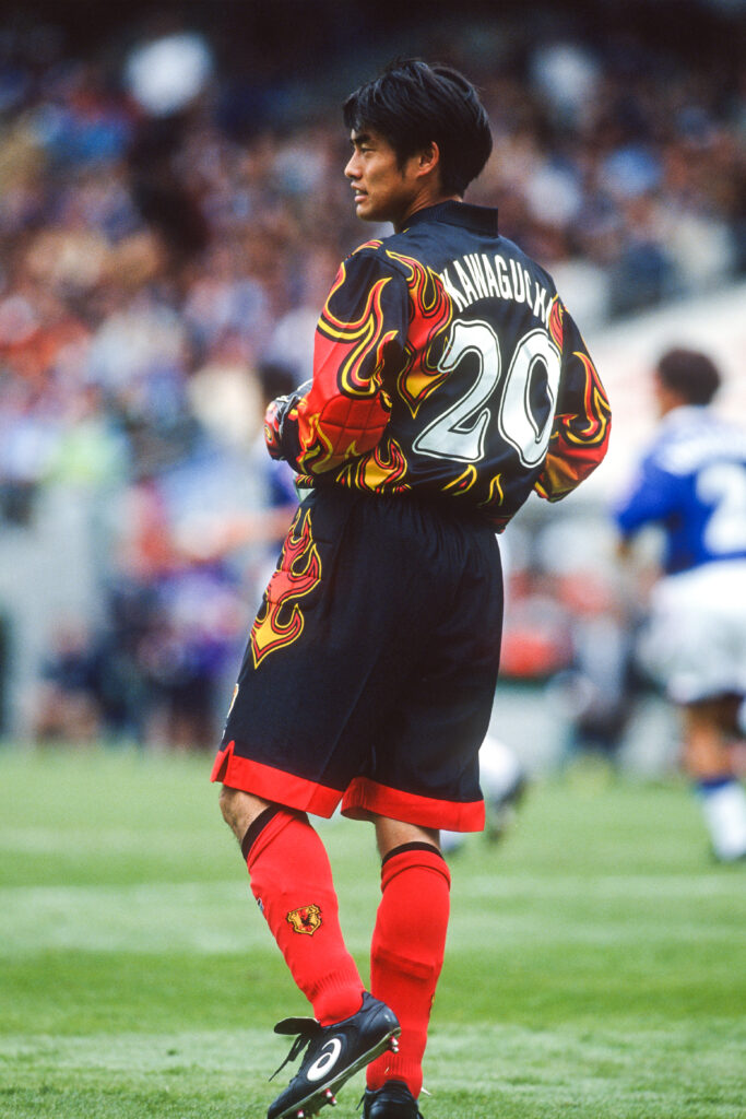
JAPAN
1998
Look, you can make the argument that this kit looks like something you might find on Guy Fieri’s bedroom floor, but you’d be selling short the boldness of this legendary jersey.
It was worn by Japanese goalkeeper Yoshikatsu Kawaguchi at the 1998 World Cup in France, making him literally and symbolically on fire. His flame-adorned kit stood in wild contrast to the classic “Samurai Blue” jerseys of his teammates. Designed by Asics, the flames are said to invoke the passion and fearlessness Japan tapped into to secure its first ever World Cup appearance. While the deeper reasoning is appreciated, Japan sadly went 0–3, scoring only one goal, leaving Kawaguchi’s kit as the most memorable element of its World Cup run.
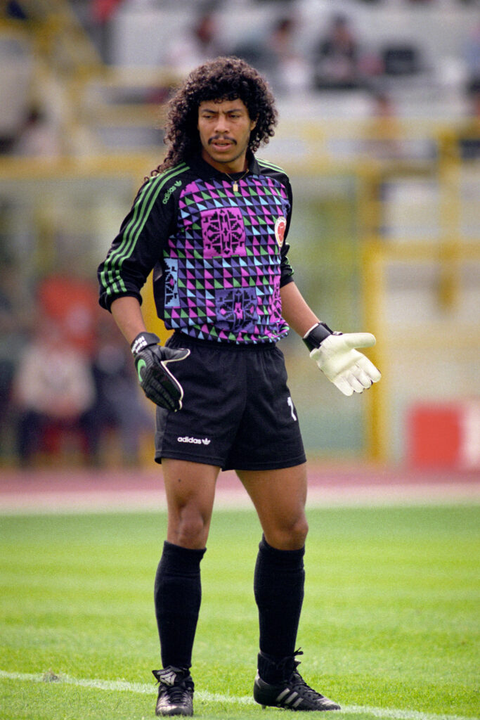
COLOMBIA
1990
If you’re designing a kit for René Higuita –– the kind of goalie who’d do a scorpion kick to make a save when it was absolutely unnecessary –– basic just won’t do. It won’t even come close. The man known as “El Loco” needed a kit to match his fearless personality, and Adidas delivered. Adorned with multi-color neon triangles and accented with graphic nods to traditional South American art, it was a perfect reflection of the legendary goalie. Today, the kit is one of the most sought-after retro jerseys on the market. Whenever one pops up online, it’s snatched up immediately.
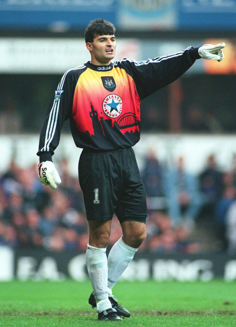
NEWCASTLE UNITED
1996 – ’97
Eschewing the bold patterns and angular designs of the time, Newcastle kept things local for the 1996 – ’97 campaign. Focusing on the Newcastle skyline with an orange-hued sunset cascading across a silhouette of the Tyne Bridge, the kit personified the team’s connection to the city in a way that has yet to be replicated. While other teams may have phrases on their collars or small silhouettes of local icons cooked into the color scheme, no team has taken a swing as big as this, which is why it’s still a fan favorite.
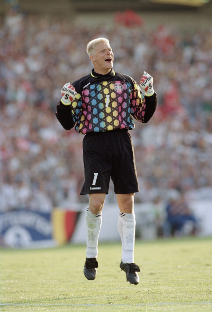
DENMARK
1992 – ’93
Sometimes, style and circumstance come together to make an unforgettable kit — such as the Hummel-designed Denmark jersey, with its rainbow gradient under a black honeycomb. Hummel, it’s worth noting, has managed to stave off the larger brands for decades, continuing to deliver incredible jerseys steeped in Danish history. But it’s the 1992 – ’93 kit that remains beyond reproach. One of the prettier looks to ever grace the pitch, the jersey also enjoyed an unmatched historical run.
It all started with luck. It was only when Yugoslavia was disqualified from the Euro ’92, after the country dissolved and fell into war, that runner-up Denmark found itself in the tournament. The Danes embraced their underdog status and went on to beat France, Germany, the Netherlands and others to claim the win. Not only did goalie Peter Schmeichel carry his team through penalties in the semifinals, he posted a clean sheet to win the final match and carried his team to victory — all while sporting one of the most classic jerseys in history.
INTER MILAN
1991 – ’92
It’s hard to call the keeper kits of the ’90s “samey,” as they were all truly out of this world, but there is a certain throughline to many of them. This was not the case for Inter Milan at the start of the decade. While most kits avoided actual symbols, Inter embraced them in the most colorful way possible: by scattering graphic arrows pointing in various directions over a neon purple background.
In practical application, the arrows pointed toward the keeper’s body, rather than the empty space in the net around him. Sadly, the goalkeeper rarely used it: It was the third option for the keeper who often went with the more tame first and secondary designs.
REPUBLIC OF IRELAND
1996
Though the Republic of Ireland and its keeper Shay Given nailed the kit’s color scheme, it went a little overboard on logos. Graphics and patterns were pushed to the margins so a bold purple hue could speak for itself, yet something compelled the kit designer to shove FAI (Football Association of Ireland) into every available nook and cranny, deploying various fonts and sizes, too. While we know subtlety took a vacation during this era, this nearly perfect jersey loses a few points for not letting the country badge do the job.
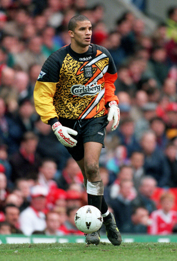
LIVERPOOL
1996